This project was a design challenge centered on transforming a word with a typically negative connotation into something visually compelling. The task was to create a logotype that expressed rigidity and compulsive precision—qualities often associated with ADHD behaviors like hyperfocus and perfectionism.
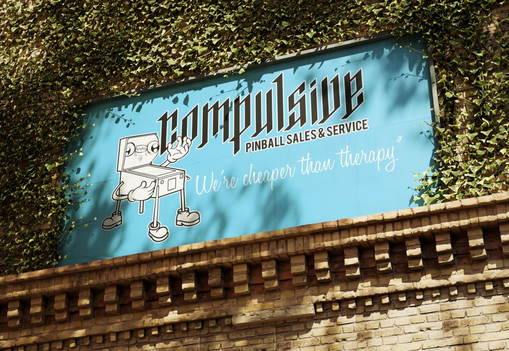
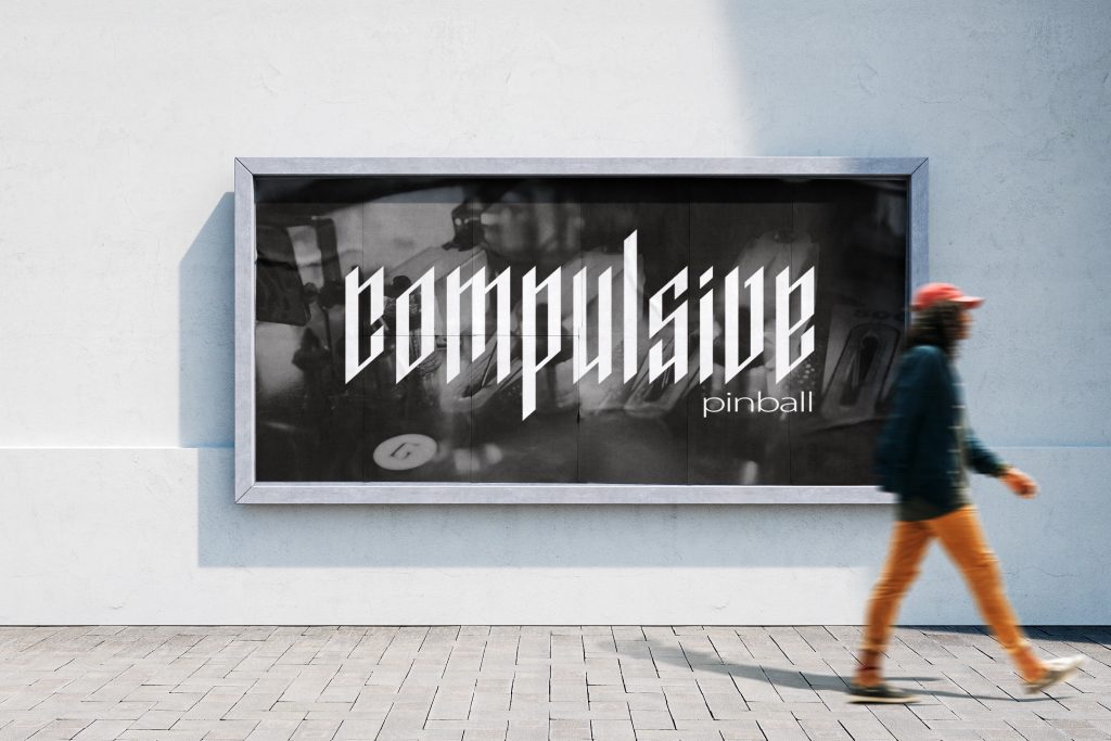
The exploration resulted in a metal-inspired logotype marked by strict geometry and exact spacing, paired with an unexpected twist: playful character studies of a “goofy pinball sidekick” that offset the intensity with humor and charm.
The Challenge
The project required me to navigate two seemingly opposite goals:
- Design a logotype that embodies rigid compulsiveness (perfect spacing, uniformity, and structure).
- Counterbalance that precision with a more lighthearted, character-driven exploration.
- Avoid letting the negativity of the word’s meaning dominate, instead reframing it through stylistic and narrative design choices.
This meant thinking deeply about letterform balance, negative space, and the emotional range typography can communicate.
Research & Inspiration
The initial research focused on:
- Typographic systems where uniformity and repetition drive the design (grids, modular type, Bauhaus-inspired geometry).
- Metal and hardcore band logos, which use sharpness, symmetry, and intensity to convey weight and presence.
- Cartoon mascots and arcade characters—sources of exaggerated expression and whimsy that would contrast the rigid type.
Process
- Logotype Construction
- Built the letterforms around strict geometric proportions.
- Ensured equal spacing between each letter, creating visual rhythm and a sense of compulsive order.
- Iterated through variations to find the balance between rigid clarity and metal-inspired heaviness.
- Exploration of Tone
- Experimented with weights and line endings—sharper treatments pushed the design into a more “metal” aesthetic.
- Tested applications in monochrome and with textural overlays to emphasize its severity.
- Character Studies
- Developed sketches of a “goofy pinball sidekick” to contrast the rigid type system.
- Focused on playful proportions, rounded forms, and exaggerated expressions.
- Explored how the mascot could act as a foil—bringing levity where the logotype was severe.
The Solution
The final output consists of two complementary elements:
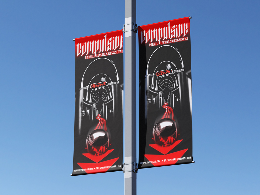
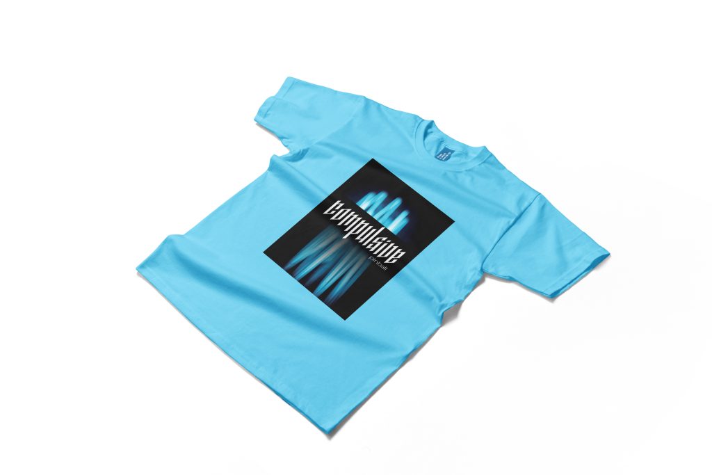
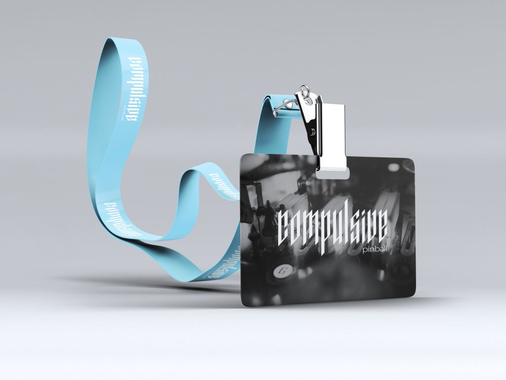
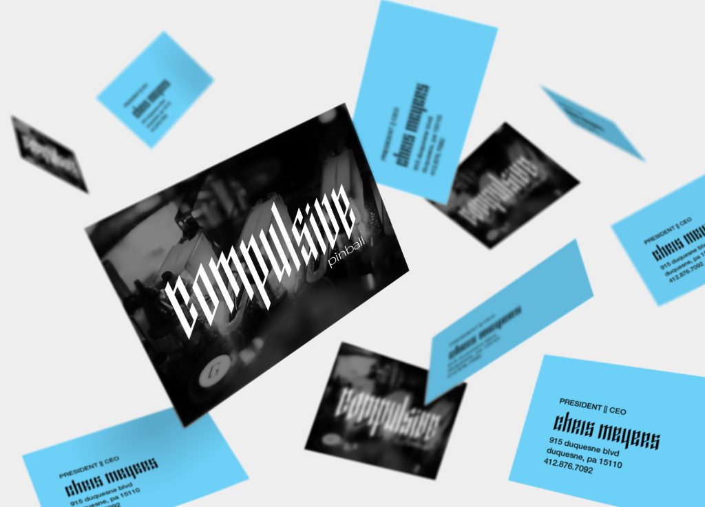
- Logotype: A precise, rigid wordmark with equalized spacing and geometric balance. Its sharp forms and disciplined composition give it a metal-inspired edge, underscoring intensity and control.
- Character Studies: A lighthearted pinball-inspired mascot, designed to humanize and offset the severity of the logotype. The juxtaposition emphasizes the tension between order and play, discipline and chaos.
Impact
Though conceptual, the project demonstrates how typography and character design can work in dialogue—one amplifying precision and intensity, the other softening it with humor and personality. Together, they create a system that reframes a negative concept into something multidimensional and engaging.
This project sharpened my skills in:
- Typographic spacing and geometric consistency.
- Balancing tone across contrasting design elements.
- Using character illustration to expand brand storytelling.
Reflection
This exploration taught me that even words with negative connotations can be reframed through design, shifting meaning by how form and personality are presented. By pairing rigid logotype construction with playful character work, I created a more complete design narrative—showing how extremes can complement each other.
If expanded, I’d explore how the character could be animated in short loops (arcade-inspired motion) and how the logotype could flex into a modular system for posters or merchandise..