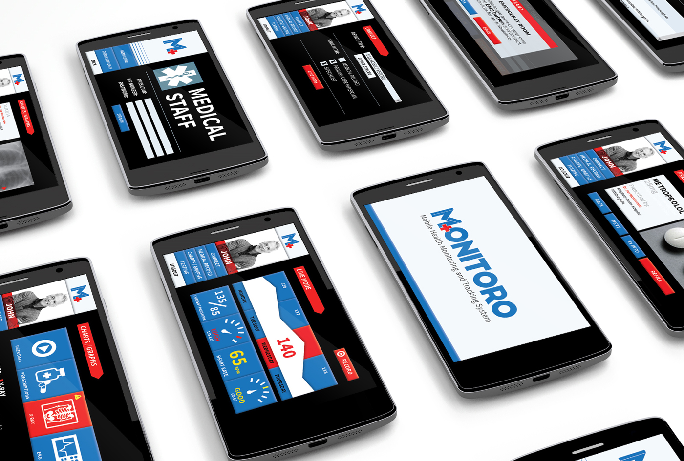
For my Graduate Thesis, I designed an entire system around the pretense of how heart disease is one of the top afflictions in the US; this was done in 2015—miles ahead of the mobile health commonplace now.


DASHBOARD
Monitoro—a mobile, health tracking and recording system, which allows patients to monitor themselves, and collects data for doctors to remotely connect to.
A login screen showcasing the patient’s stats, medications and allergies serve as a lifeline in the event of an emergency, as well as a reminder when visiting practices and pharmacies outside of their network.
Patients would sync their mobile recording device to Monitoro and record information to be applied to their medical record and shared with their provider. If a series of checkpoints are missed, abnormal readings submitted, or a trip to the hospital, an alert would be sent to the physician.
Patients own their records which can now travel between the different care providers involved in treating their condition, all-the-while helping doctors provide better care, for less overhead, than traditional monitoring programs. The dashboard serves as a mode for patients to break out from the stereotype of in-house monitoring, and ensures all of information imperative to their health is at their fingertips. Test results, prescription information and something as simple as refilling prescriptions is only a few clicks away on their smartphone or tablet.
Physicians are welcomed with messages and alerts about specific patients, giving them real-time data imperative to their patient’s status. With a few clicks of a button, doctors can acknowledge alerts and contact supportive staff. Physicians can also check practice notes, and share with other caregivers.
PACKAGE DESIGN
The proposed monitoring products are all existing sport tracking devices, specifically chosen for their ability at treating heart disease, tuned to work with the recording feature of the dashboard. Users pushed for packaging and devices to be a simplistic style, promoting the look of modernity, while still being easy to understand what each product does and what it looks like.


The proposed monitoring products to pair with the MONITORO Mobile Health Tracking and Monitoring dashboard are all existing sport tracking devices, specifically chosen for their ability at treating heart disease, tuned to work with the recording feature of the dashboard.
The Medical Record is a USB wearable, capable of being a simple lifeline in the event of something happening while the patient is out-and-about, constantly updated wirelessly through multiple checkpoints throughout the day. Made of paracord, users found this to be trendy and sturdy, with simple directions allowing all sorts of users to get up-and-running with the product. Opened by sliding off the sleeve with a picture of the product, the lid lifts, showcasing the item inside. Contained within soft foam, the directions hide the connecting cables for the device, and act as a solid base for housing the wearable at home and during shipping.
The Pulse Monitor is a simple and indiscreet ring which would be set to take readings at timed intervals, or manually set to record data to the dashboard. Sitting on any finger, users found this device compatible with everyday life, and not some overbearing item that gets in the way.
The Blood Pressure Cuff gently applies pressure to the wrist to collect information while being compatible with many fashion preferences. Constructed of durable plastic, the pressure cuff is made to withstand a variety of outdoor conditions.
The Prescription Medication Dispenser allows users to carry their multiple-dose, daily heart medications without worrying about missing dosage times or refills. Complex medications and dosages are now simplified thanks to the four-time daily dosing ports, opening at pre-timed intervals during the day.
All of the products share the same style from the MONITORO visual system, and uses a white plastic slider over the colored box on the inside. Each item is secured with laser-cut foam, and houses all content and charging items related to the individual item.
With other materials, like a brochure and a matching website, users were (in theory) able to monitor their heart care and have a clear communicative vehicle between them and their provider.
